Popup menus - Flickr vs. Google
A few weeks ago Google quietly opened up SearchMash.com.
While SearchMash is not branded with the Google brand, the fact that it is being operated by Google was quickly revealed and widely discussed:
- http://blog.outer-
court.com/archive/2006-10-02-n30.html - http://ajaxian.com/archives/searchmash-googles-playpen
- http://blog.searchenginewatch.com/blog/061002-192616
- http://googlesystem.blogspot.com/2006/10/searchmash-new-google-search-site.html
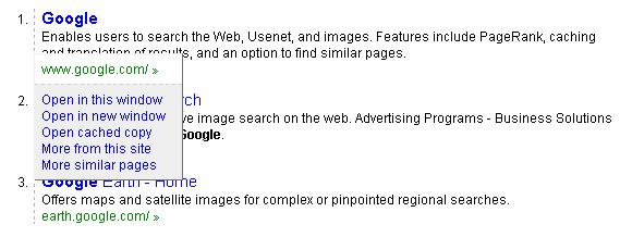
The most surprising change for me was the behavior of the green link:

Since it looks like a link, and smells like a link, you'd probably expect it to - duh - behave like a link, and take you to the web page it points to.
This is not the case in SearchMash though. When you click on the green link, you get a *gasp* popup menu with options:
Looking at the menu toolbar on the top of the Flickr page, you'll notice a list of links, and a small arrow next to each one of them:

When you click the arrow, a drop-down popup menu opens up with a list of options:
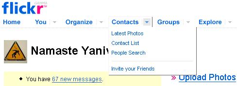
Which is great. But, if you didn't notice the arrow, or you don't understand what is it supposed to do, you can simply click the link:

What's really nice though, is that once you click the link, you get the Latest Photos page - but you also get the same list of links which were in the popup menu listed at the top row of this page, so you're still able to navigate to them.
I find the Flickr choice of user interface a much better balance between retaining compatibility with existing habits and known metaphors, and providing new functionality.


 Subscribe