Popup menus - Flickr vs. Google
A few weeks ago Google quietly opened up SearchMash.com.
While SearchMash is not branded with the Google brand, the fact that it is being operated by Google was quickly revealed and widely discussed:
- http://blog.outer-
court.com/archive/2006-10-02-n30.html - http://ajaxian.com/archives/searchmash-googles-playpen
- http://blog.searchenginewatch.com/blog/061002-192616
- http://googlesystem.blogspot.com/2006/10/searchmash-new-google-search-site.html
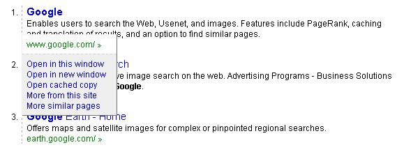
The most surprising change for me was the behavior of the green link:

Since it looks like a link, and smells like a link, you'd probably expect it to - duh - behave like a link, and take you to the web page it points to.
This is not the case in SearchMash though. When you click on the green link, you get a *gasp* popup menu with options:
Looking at the menu toolbar on the top of the Flickr page, you'll notice a list of links, and a small arrow next to each one of them:

When you click the arrow, a drop-down popup menu opens up with a list of options:
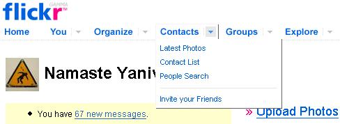
Which is great. But, if you didn't notice the arrow, or you don't understand what is it supposed to do, you can simply click the link:

What's really nice though, is that once you click the link, you get the Latest Photos page - but you also get the same list of links which were in the popup menu listed at the top row of this page, so you're still able to navigate to them.
I find the Flickr choice of user interface a much better balance between retaining compatibility with existing habits and known metaphors, and providing new functionality.

 Subscribe
3 comments:
There is another problem with Flickr's interface as opposed to searchmash.com.
In searchmash.com, The green "link" is pure text, which means that if I have different font settings or zoom settings it will behave accordingly.
Flickr, on the other hand, made the menu itself (Contacts, Groups, Explore, etc) Images which rotate to an image with an underline when you pass over it with your mouse, giving you the impression of a link, but when you have different font settings or zoom settings, the root of the menu stays at the same size, while the menu which popps will look according to your zoom/font settings since it is pure text.
Now that's an interesting design question. Why did they choose to do it that way instead of just leaving the small down facing arrow an image and keeping the rest of the menu as it should.
Eran, I thought Yaniv's point was that Flickr was better so stating this as "another" problem with Flickr seems to have misinterpreted the original post.
I agree, Yaniv, I think Flickr did a pretty nice job here. I haven't used SearchMash much so I can't compare, but your assessment of the dual-functionality of Flickr's menus seems right on.
Eszter, I think (and Yaniv will probably be able to further clarify it) that the major subject of this post was about usability or, more specifically, breaking conventions. Flickr was brought in as an example of a good interface design decision as opposed to SearchMash.com.
I wanted to point out that there is a problem in Flickr's interface which, at some level, is similar to the problem in SearchMash.com - they also broke convention and made Flickr less usable to people who changes their fonts/zoom settings or for people with some kind of disability that requires them to change the fonts/zoom settings (which is more severe).
Perhaps I was a bit too English illiterate when using the sentence "There is another problem with Flickr's interface" as the first sentence, which was (probably) not that bright of me :-) (or it was just too much sugar).
Post a Comment